Feature Design, UI + UX / Design Lead
FC 24: Design Lead
As an Experience Designer on EA Sports’ FC 24 Ultimate Team, I took on a leadership role in redesigning the in-game Items system— one of the title’s most visible and high-impact features. Tasked with establishing a refreshed visual identity that could scale across seasonal campaigns, I led the creation of the new Base Set and art-directed key campaign items, working closely with producers and engineers to ensure seamless integration into the live game. Beyond design execution, I contributed to team development by organizing 3D (Maya + Keyshot) training and onboarding sessions, reinforcing a culture of collaboration, mentorship, and creative excellence.
IMPACT
70%↑
Player Approval Rating
10% ↑
Icon Legibility
5% ↑
Faster Asset Workflow
Reduced In-Game Memory Usage
Optimized Information Architecture
Scaled Team Item Design Workflow
Problem
The in-game Items — a core player-facing feature in Ultimate Team — were in need of a comprehensive visual and experiential overhaul to align with evolving brand aesthetics, modern gameplay expectations, and a growing emphasis on campaign identity. With increased complexity in seasonal campaigns and a broader creative scope, the challenge was to create a foundational visual system that balanced innovation, clarity, and scalability while maintaining performance across platforms.
Role
As an Experience Designer on EA Sports’ FC 24 Ultimate Team, I stepped into a Design Lead role for the in-game Items team. This entailed driving the visual and experiential direction of a Quad-A feature, collaborating cross-functionally with producers, engineers, and fellow designers. I also provided creative leadership through art direction, feedback, and team mentorship — including 3D (Maya + Keyshot) training and onboarding sessions to support both new and existing designers.
Solution
I led the full redesign and refinement of in-game Items, crafting a new visual identity starting with the Base Set — which served as the foundation for all subsequent Item variations and campaign designs. By closely collaborating with producers and engineers, we ensured seamless implementation of visual updates without disrupting player experience. I also played a key role in art directing campaign Items, ensuring alignment with the newly established system while encouraging creative expression across the team. To support scalability and team growth, I facilitated 3D training sessions, empowering designers with tools and workflows to bring high-quality assets to life efficiently.

Export Guidelines
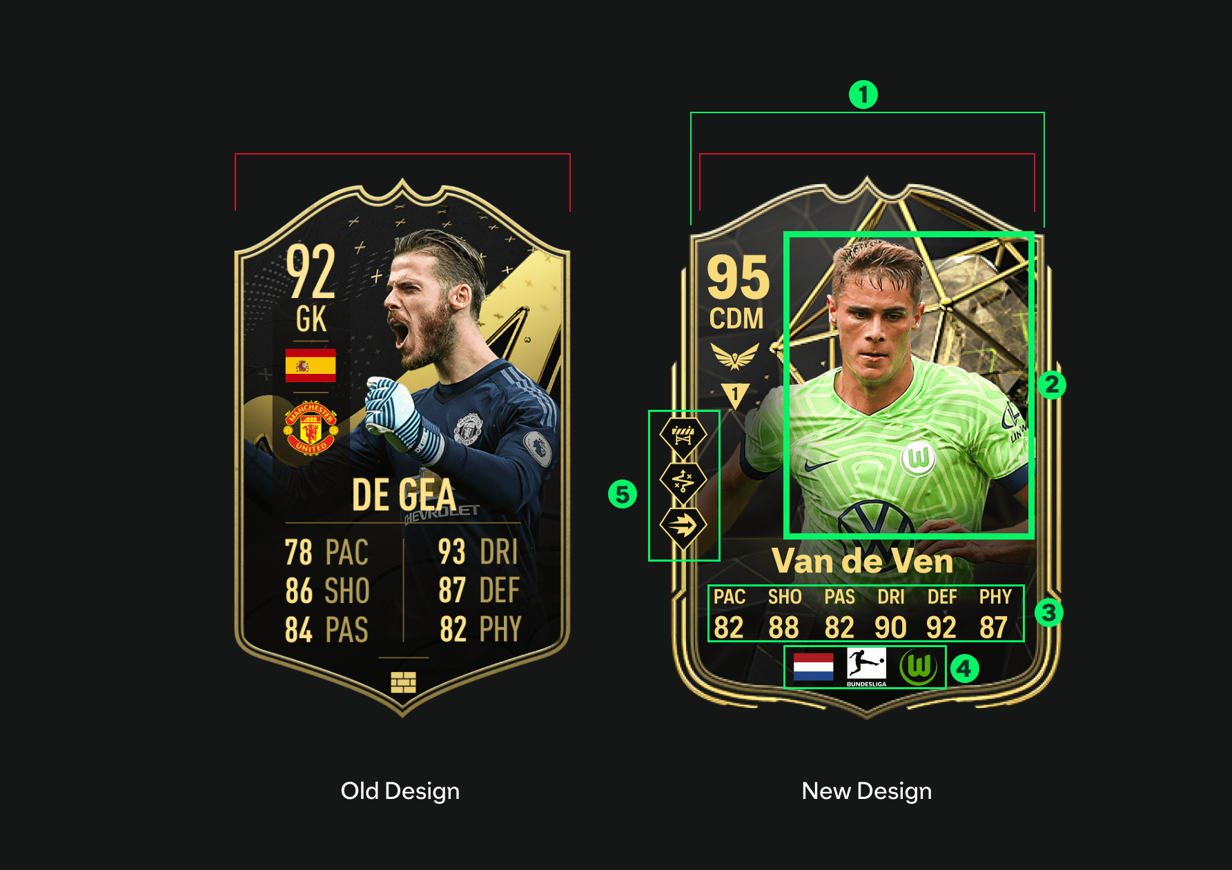
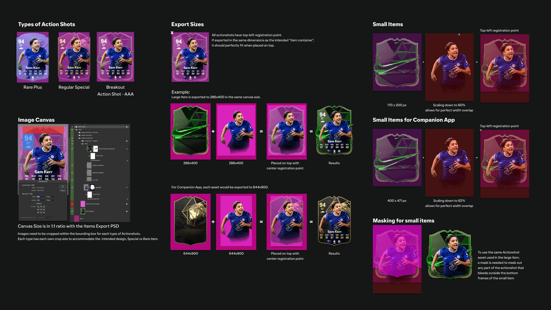
As the Design Lead for this feature, I developed guidelines for how the Player Images (Actionshots) should be exported and treated for different scenarios. Each Player Item will have a different actionshots, and to maintain consistency with the intended design, this guideline will provide directions to the designer giving the raw images photo treatment and how to crop each image for the different Item Sizes and resolutions. This ensures that all the Player Items will receive the best possible actionshot that will complement the Item Design.
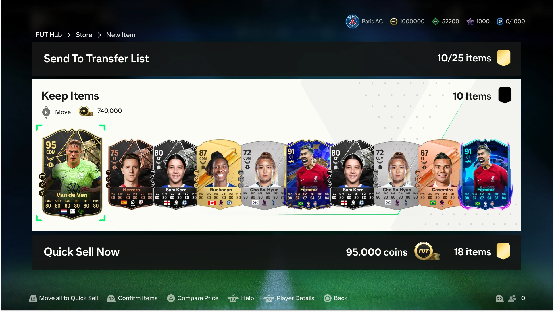
Collapsed Version Removal
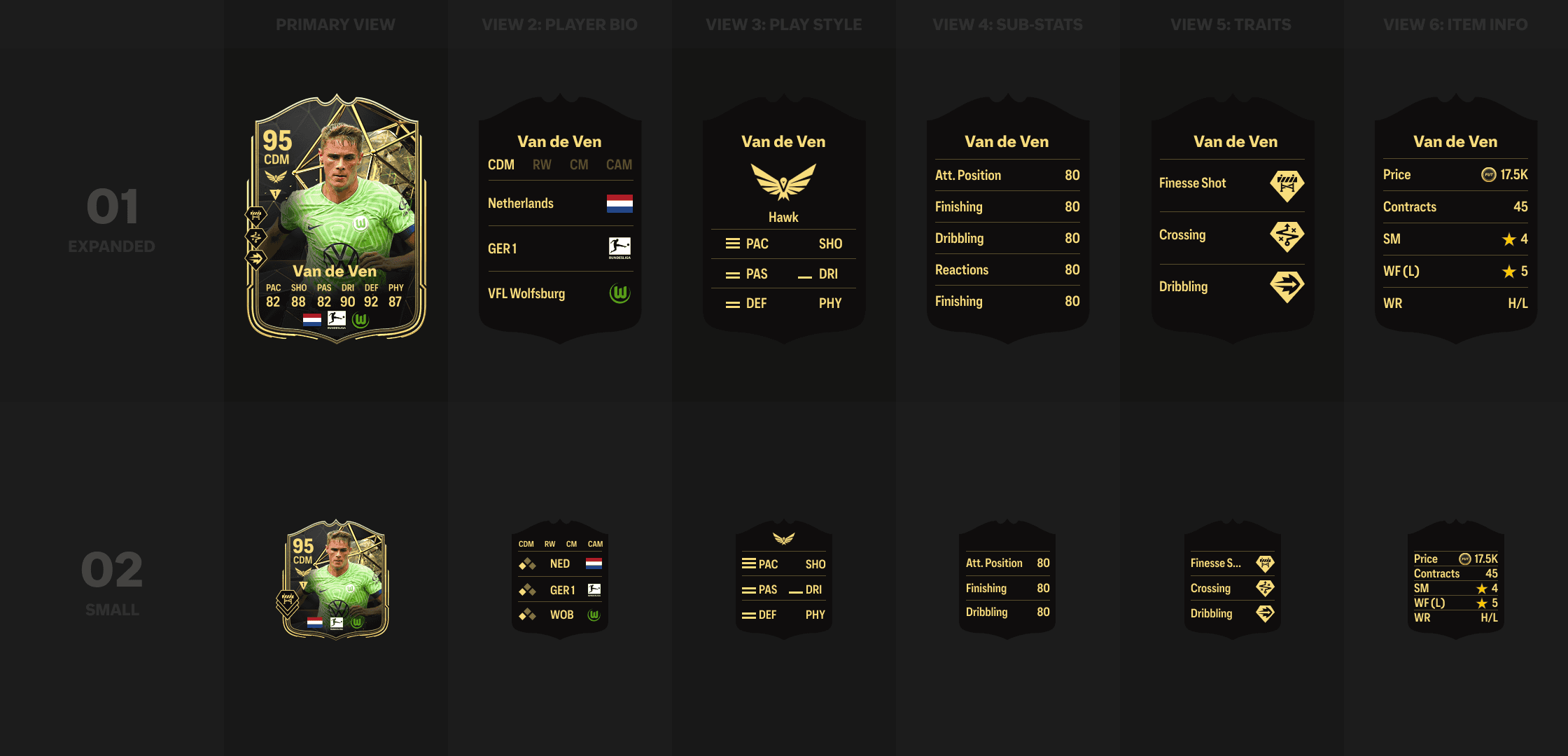
The ‘Collapsed’ size of Items was created to support the display of Player Items in some of the legacy screens we have in the game. This version contains a condensed version of the stats found in the item. Through a couple of auditing the legacy screens, I found that this Item size is only used in a total of 4 screens, and through partnership with UX Design, we found solutions to remove it.
With its removal, the process for creating the Art Cut ups was improved by 5%, shaving at least 1 hour of designers’ time. It also removed some memory used in-game, improving the game’s run-time.


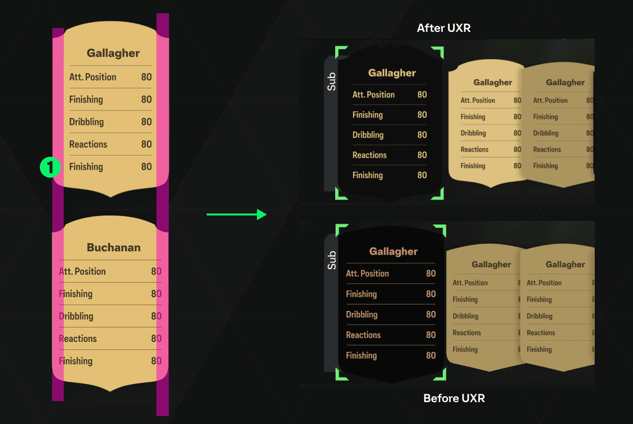
Solutions from UXR
Through regular build reviews, I noticed a couple of problems with the redesign. For example, some of the stats displayed horizontally, are being covered by other items when viewed in some areas of the game, like in the Active Squad screen, which is a very important screen for players.
While this is a compromise the dev team wanted to take, I wanted to know how much impact this will have on players. I partnered with UX Research to gather some data during one of our playtest sessions.
UXR Questions:
How important is it for you to view all the stats without having to scroll to the other items?
How easy is it for you to recognize the flags/crests/icons at the bottom?
How do you feel about the new layout of information on the Player Items?

The Play Test provided me with some interesting insights. First of all, the last question validated the overall redesign of the item. Players felt that the new information layout is fresh and easier to read and glance through. However, more than 70% of the. players felt that having to have to scroll through the Items to view all the stats information will have some impact on their decisions when choosing a player. The logos and icons at the bottom are also too small sometimes for them to recognize what they are.
Solutions:
I’ve increased the margins on both edges of the item. This is also reflected on the other views of the item. With this change, all the information on all the view is visible even when the items are on the horizontal stack. The distance between the stats is still adequate to allow legibility, as well as, accommodate localization to other languages.
The vertical spacing was also adjusted to accommodate a 10% increase in the icons sizes. This allows the players to recognize the icons and logos even when the Player Items are scaled down when stacked horizontally.
Overall, with these little improvements, the functionality of the Player Items is refined, enhancing the quality of life of our players. The UXR test results were very important in improving the game’s quality as Player Items are one of the key elements that make Ultimate Team work.
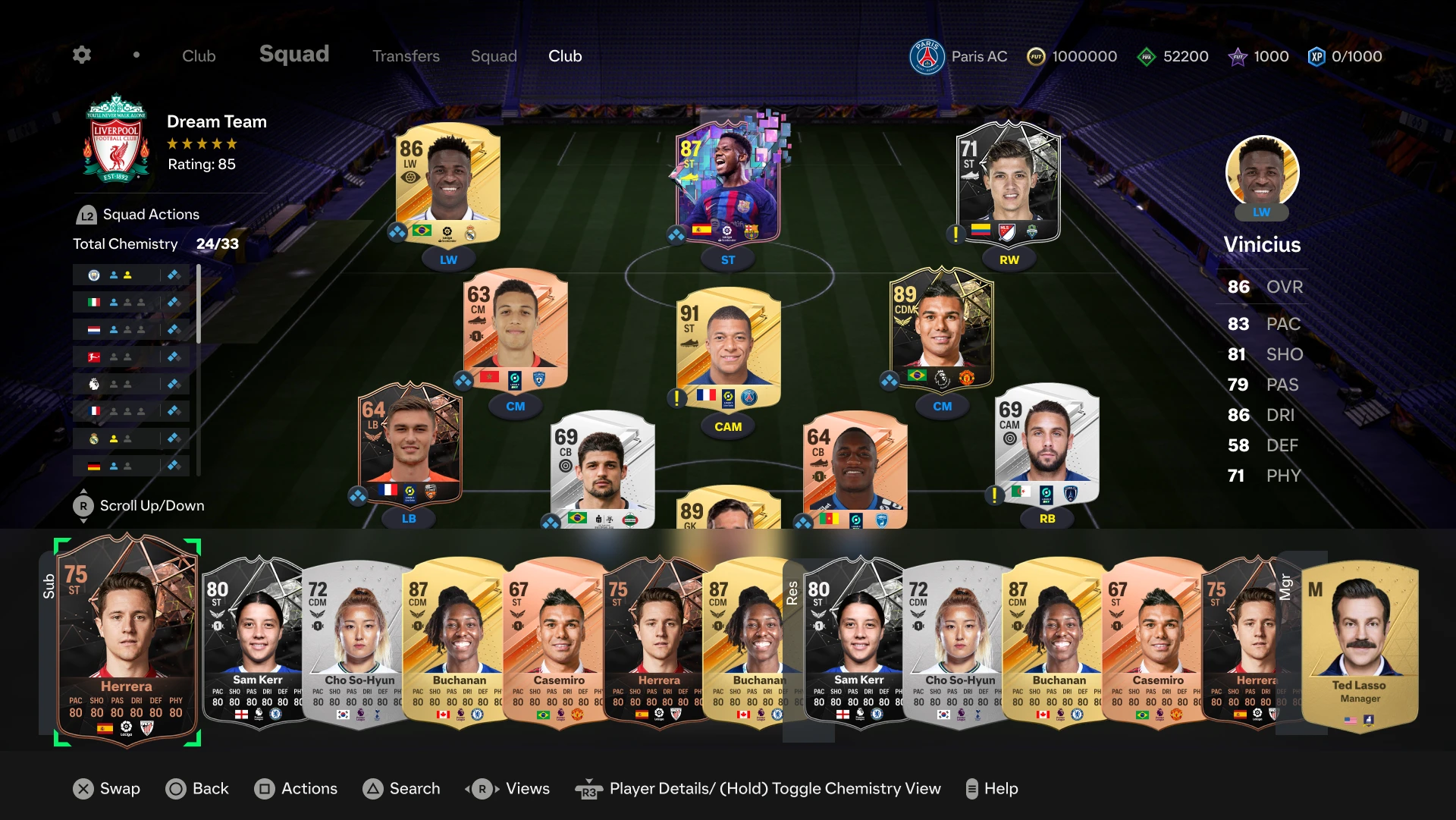
02/ Player Items Design
FC 24 Ultimate Team (UT) lets you build your dream squad from thousands of players around the world. In UT, players are represented by Player Items – special shields that show off each player’s unique in-game ratings and attributes.
Every base player in UT is Bronze, Silver, or Gold, and has a Common or Rare designation. CONMEBOL players are unique in being represented as a “Special” item design but behave the same as Bronze, Silver, or Gold players. In addition to these item types, there are also other Special Item designs which recognize select players’ real-world past or present achievements, performances, or participation in various tournaments, as well as prestigious ICON items for some of football’s greatest-ever players and new FUT Heroes items for the game’s most memorable players.

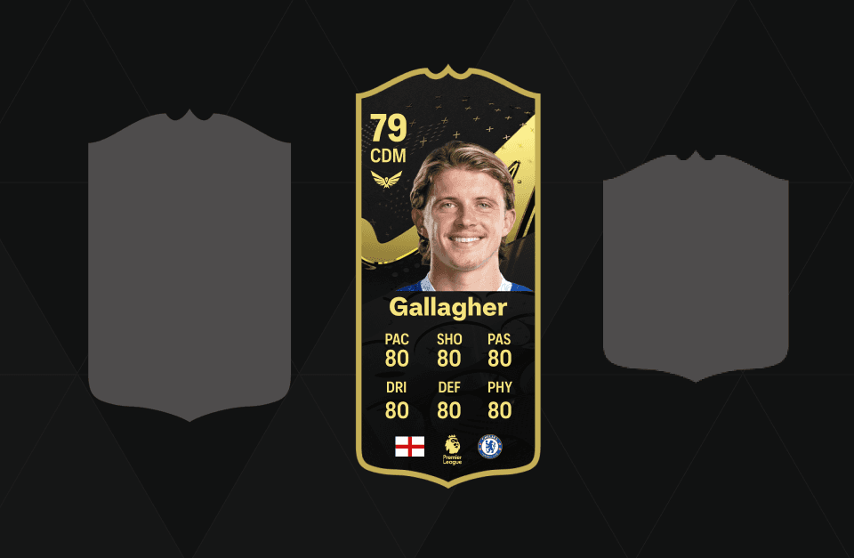
Designing the Base Set
The Player Items Base Sets are the most basic Player Items in Ultimate Team. The set is composed of the Common Item, Rare Item, and Team of the Week Item, together with their Bronze, Silver, and Gold counterpart. These items will set the look and feel of all the items in FC 24, as well as, provide guidance to the tiering of all the other items.
With the design of the Base Set, the conversion of the Visual Identity to 3D is also defined, which will be used to guide the 3D elements in the other Player Items for Ultimate Team.

